10 Delicious Web Layouts for Restaurant Owners
- Design
-
August 17, 2017
Running a successful restaurant is no small feat. But, in order to be successful, you need a constant stream of patrons who will visit your venue on a regular basis. The best way to ensure this is to create a website for your restaurant. By doing so you will be able to share your menu, your opening hours, and your locations. That way, people looking for a place to eat will have no problems finding you. Here are few high-quality restaurant website design templates that you should try in your design.
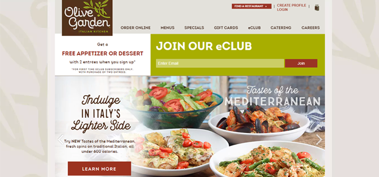
The Olive Garden’s use of a slideshow that fits the width of your screen is an excellent method of bringing the cuisine front and center. With well-structured menu and all details, it drives more hungry customers. There’s no need to draw up Google Maps to find the nearest location, as an overlayed map provides that necessary info for you right on the homepage.
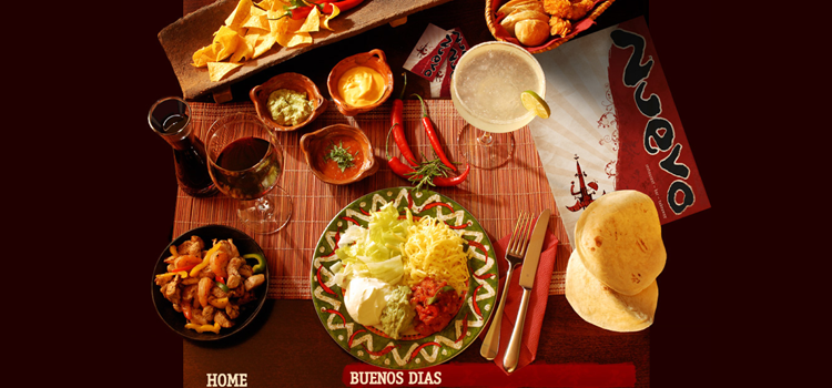
Nuevo is one of the best resources for a restaurant owner to get ideas of an attractive layout. An overhead shot of a table setting, complete with restaurant cuisine sets the tone for the website. By its graceful design, you can almost taste the food!
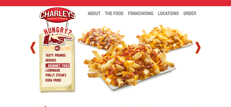
Charley's serves the customers over 25 years. It comes with well-furnished design, effective layout, high-quality images, delicious menu and stunning slider. You can take the reference of this layout and make your site unique.
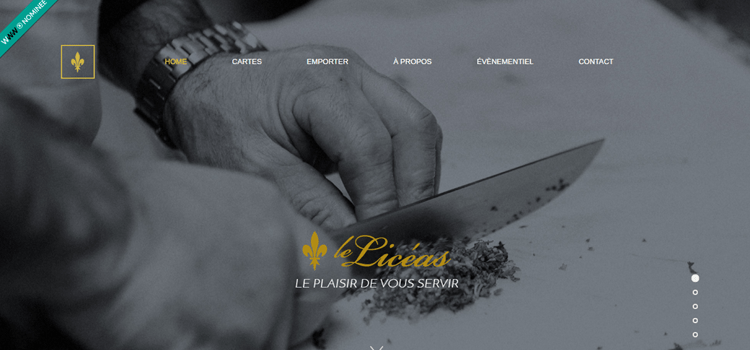
Liceas offers a simple yet unique design. They’ve successfully brought both visual design elements and usefulness into their website. Business hours, location and contact info is there on each page. This responsive design is created with WordPress.
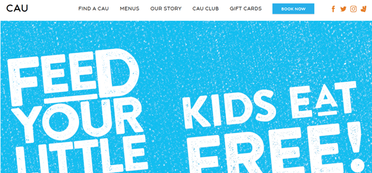
This web layout is designed on the basis of the target audience. If it is a students’ cafe, a clean and bright design will be a perfect choice. But if you are trying to engage the more serious managers and office workers, go for an elegant or professional style. CAU Restaurant is designed in the same way.
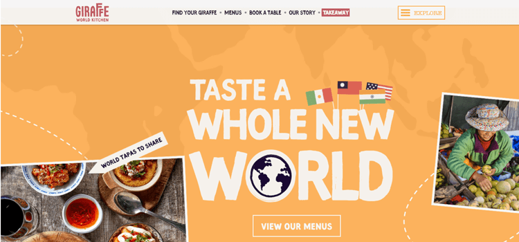
Giraffe has an extra website page, slider image and pop-up window for a brief description of it. Here you can see an offer in a slider. The visitors of this website are updated because the offer is on the main page.
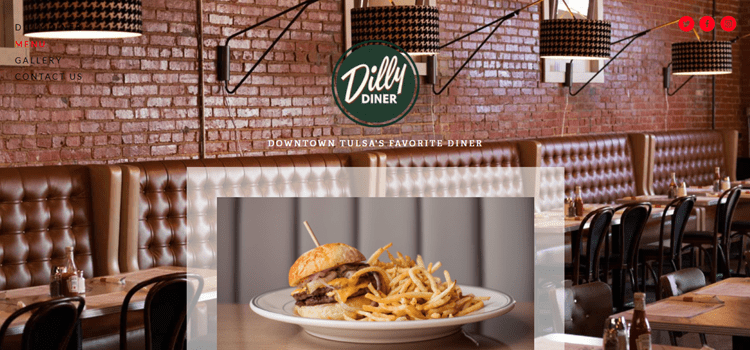
This web design has a family type of feel going on. It is full of colors and graphics with great images that definitely get you interested in what they are offering. They mainly focus on just their food.
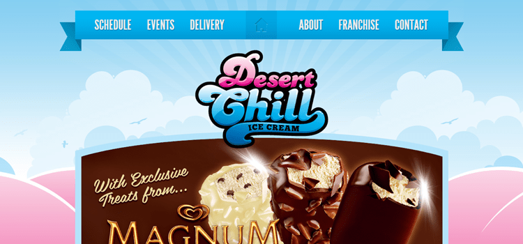
Desert Chill was formed by enterprising brothers Dan and Nathen Furlong based upon childhood memories. Desert Chill has all the qualities and ingredients to fill you up and cool you down, in a unique way possible. With a delivery schedule, events, delivery options and franchising it is most decent design.
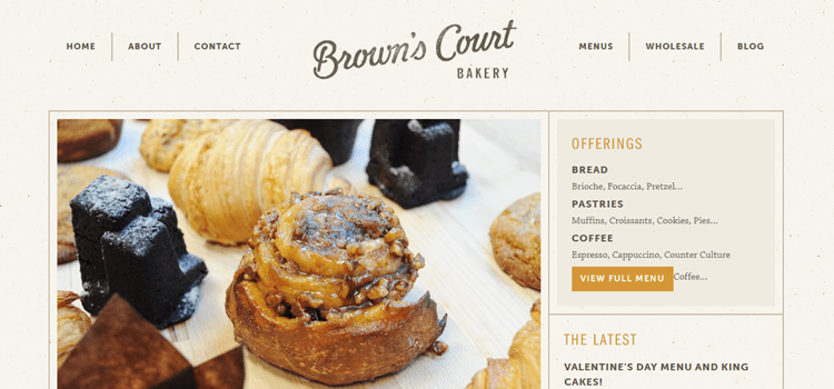
Brown's court bakery web design is very creative and elegant with an attractive slider and high-quality images. The vintage feel and really balanced flow almost take you out the mindset that this is a bakery.
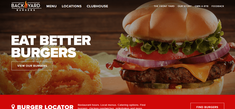
Backyard Burger’s website illustrates how displaying the food front and center is a simple and effective way in garnering the attention of customers. Theme with red color is the symbol of passion and secret desires.
