Easy Tips to Improve User Experience of Your Website

- Design
-
June 18, 2018
You may be going to the same store for grocery every time and you also have your favorite restaurants. Right? There is a reason we go to the same place every time. The reason is the positive experience they provide while you shop or eat. Same applies while a customer land on your website. What they are looking for is a reason to come back to your online store. Now the question is, How will you get returning customers? The answer is 'User experience'. It is a must thing to focus on while designing a website. And it must be engaging and positive for the users to return back to your website. Here is a guide to improve your website's user experience. You can improve user experience of your website by using these tips. Have a look!
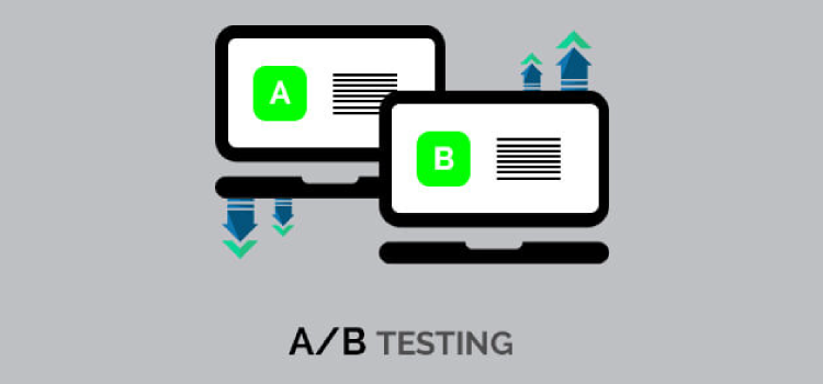
A/B Split test

Designing the perfect landing page is always tough. There comes multivariate test to the rescue. A multivariate test will help you in redesigning the elements of your page where the impact is most. You can test several combinations of the page elements to decide which performs well.
- Testing text and visual elements on a webpage together
- Testing the text and color of a CTA button together
- Testing the number of form fields and CTA text together
A/B testing (also known as split testing or bucket testing) is a method of comparing two versions of a webpage to determine which one performs better. You can experiment with this method when you are not sure which page will gain more conversion.
Allow Seamless Navigation
Navigation helps your visitors explore your website. What if your customer finds your website difficult to navigate? They will simply leave the site and move to another or maybe to your competitor's site. Improving the navigation of the website can help prevent this.
It also includes a consistent design of your website. You must use the same typography, coloring, button styles, spacing etc to maintain the consistency. Match everything on site. An inconsistent design will make your customers feel whether they're still on your website or someone else's. Sudden design change from one page to another on the same website will make your users feel lost and confused. Making things clear, visible and easy to explore will make your site trustworthy to your customers.
Catch Your 404s

404 is the second most common reason for visitors leaving a website. 404 pages completely disrupt their journey on the website. It can make a user annoyed to land on 404 page and make them rethink spending time on your website. They might choose your competitor over you. You can set up Google Webmaster tools on your website To check if you have any 404s. Just make sure when a user gets to land on a 404 it provides an option for the user to get back on track which will improve user experience of your website.
Here are some great example of 404 page design.
Choose Colors Deliberately

With an infinite number of possible color combinations out there, it can be hard to decide what colors will make the biggest impact on your site or app. Choosing colors for your website is the most crucial thing for the visual appeal and UX. Certain colors can attract and draw in certain customers. Also, Colour is one of the main factors in customers’ perception of a brand.
A poor choice of color influences the user experience in a negative way. Apple, Wikipedia, and the New York Times all feature grayscale colors, symbolizing a calm trustworthiness. Whereas most of the food chain uses bright colors like yellow & red putting a visitor in a mental state to make a purchase.
Visuals / Use Images

“A picture is worth a thousand words.” This is very true in today's online world. A high-quality image on your website can keep your visitors interested and engaged. Images are a powerful way to capture users’ attention. Images can convey more than a block of text to the user. As per the statistics, 90 % of information human mind perceive is visual.
Tips:Using your product's real images instead of stock images will help gain visitor's trust. Remember, the purpose of your site is not just to showcase images. Instead, the images should showcase the purpose of your site.
Introduce Proactive Chats

Proactive chat is a live chat feature that allows your site visitors to have a one to one interaction with your chat agents on your website. Proactive chats give a feeling to visitors that they are dealing with real persons. Also, It can provide an instant solution if visitors have any questions or doubts or any problems they're facing with your website. Proactive chats help make the user experience more improved and positive.
Example:Forbes magazine reported in a recent study:
“In 2008, Wells Fargo made a second attempt to leverage online chat to drive sales, and happily, this time the results have been crystal clear. High customer satisfaction scores and a double-digit increase in converted shoppers have shown the value once and for all of this technology.”
Have Proof of Authenticity

When a user invests their money on your product, it is perceived that customer must get a legitimate and original product and value for money. Visitors are always skeptical about the authenticity of the product they're purchasing. E-commerce websites need to make sure that customers know the products are original. To prove this, a digital marketing agency conducted A/B test. https://vwo.com/blog/increase-in-sales/
To ensure customers knew that Express Watches stocks original products, HP-Group replaced an image on the right-hand side of the product that initially said “Never Beaten on Price” in the control.
Control: Never Beaten on PriceThe variation said “Seiko Authorized Dealer Site” in strong blue, black and white.
Variation: Seiko Authorized Seller SiteThe result was a 107% jump in conversion rate during the 30-day test, Proving that authenticity of any products surpasses many features.
Highlight Your Customer Testimonials

Customer testimonials are an assurance to the visitors that people trust your brand. It is the human tendency to incline toward a brand that is already trusted by others. Testimonials strengthen the credibility of your brand and products. Testimonials are a valuable form of social proof that presents a good value claims of your products to your customers.
It helps to find out the real-life experience of the customers that invested on your website by purchasing your product. It also shows that you have legitimate customers base and a good product that people are ready to buy.
Mobile compatibility

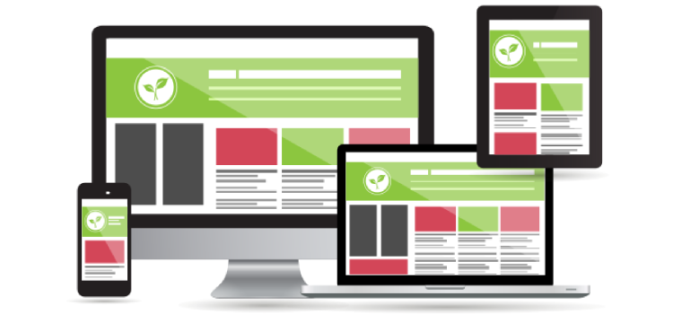
In a world where even a newborn has its own social media accounts, you must consider that most of the website's visitors will visit via their mobile. A screen size of different devices varies, so you need to make sure that your website looks great on every screen size. Otherwise, visitors will leave.
The number of users accessing the internet through mobile has already exceeded than the number of desktop users. Google has also started penalizing websites which are not responsive. So making your site responsive is a significant and very crucial part to improve user experience.
I hope this guide will help you revamp your website without shedding many dollars on a complete redesigning. Do you have any more user experience improvement ideas? Do share them in comments. And feel free to send this to anyone who needs these tips.


