9 Tips for a Landing Page Design that Maximises Conversions
- Design
-
July 30, 2018
One online business should have an amazing online website which represents its services and products. For that, an online website should also have an awesome landing page which actually includes/cover all the information about the business and offers. If you are looking to generate leads for your business, you need to have a strong landing page strategy. Landing pages are at the forefront of your brand’s reputation for your new visitors. Every website needs a landing page to ensure that visitors click on the most relevant page. Here are the tips for a landing page design that helps you to improve your conversions.
A landing page is any webpage where you send your visitors in order to initiate a conversation and make a deal. You definitely need to make your landing page a positive user experience to get a higher conversion rate. You can use a landing page almost for any purpose whether it is to capture email leads, get traffic, to announce an offer, to invite people for webinars and conference, to let your customers know about the current discounts on your products etc... end of the day the choice is yours. But, that purpose should be very clear and linked to an appropriate CTA(call to action). Here are some points that you should keep in your mind while designing a landing page which maximizes the conversion rate for your website.
1. Set and Understand your campaign goals
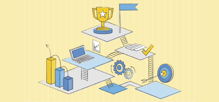
Everyone thinks that goal is obvious, but the fact is that most of the landing pages have more than one offers. Keeping all the offers on one landing page will make your visitors have poor user experience as they have to find the offer which matchs their requirements. Your user gets confused and may leave the site. If you have your goal and you have landing page design keeping your goal in your mind, you will definitely get the result. Create your landing page which focuses on only one offer or product. This way, the user will not get confused and leave the site. The landing page sole purpose is to get users to click on a button you want, download your product, in short, generate a lead.
Create a landing page that focusses on one goal in order to increase the conversion rate.
2. Make a positive first impression
If you have a landing page, you should have a great first impression which makes your website look professional and more interesting. Landing pages are often the first touch point for your customers with your brand/business. So, it's very important to create a great first impression and user experience to your visitors. Landing pages are the best and amazing tool for you to do that.
To make an impressive landing page design,
a) Keep your message clear and consistent with your landing page. This kind of message matching pages helps you to improve a positive landing page experience.
b) Use original, engaging and unique content on each of the landing pages. Your users don't want to see the same content on all different landing pages. So, rather than copying and pasting the content from one landing page to another one, create a new and unique content for rest of the landing pages.
c) Put your unique value to visitors quickly. Sometimes you just have to talk with excessive pride about what your brand is going to provide and why they should choose you over the competitors.
d) Use straightforward and appealing selling points on your landing page in order to improve a conversion rate and increase your ROI.
e) Make sure to put an contact information or social proof (ratings, reviews, testimonials & social accounts) of yours in order to establish an emotional connection with your target audience.
3. Navigation / Flow of text
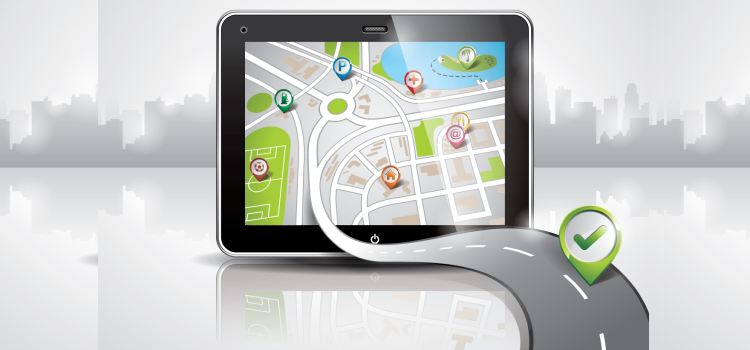
Making it easy for users to find what they are looking for is one of the most important parts. No one will go to the detail page if they are not satisfied with what you have to offer from the landing page outset. For better conversion, you need to have your landing page copy to be convincing to get to the point and don't forget to be genuine.
Visitors want to be agreed before they make a purchase. If they don't feel informed enough, trust enough and secure enough, they are not going to make a purchase from your website. People much more likely to buy if they feel like they arrived at the solution on their own.
However beautiful your page is, users will not convert if your landing page content is not convincing.
4. Clear headline
Like a great subject line for email, your landing page's headline gives a quick, impressive and compelling brief of the subject that included in the landing page. Your headline should be of few words which set up expectations with clear, concise, and action-oriented language. You need to spell out why your visitors can get benefit from the offer on your landing page in certain terms.
5. Proper Content
The content of your landing pages should be all about the users. Visitors are not interested in knowing your life story and why your business is better than the other businesses. They just want to know how to solve their problems. Your content should be unique and has its own selling proposition.
6. Emphasize the value proposition
Let your customers know what unique things you have to offer to get their attention. To bring out the right value proposition for your products/services, you need to know about your audience’s pain point and craft marketing messages covering how you can help them. To see the greatest return on the investment, businesses need to build effective landing pages and then test/optimize them to maximize conversion rates. Highlight value proposition to get your user’s interest.
7. Loading Time
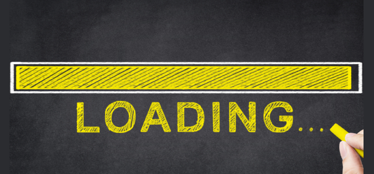
The loading time has a very strong and direct relationship with your conversion rate. You can spend your time designing a better landing page with perfect images and content. But, all of it won't matter if your page loading time is too high. It's very important for your landing page to load within a few seconds – or you can lose a customer.
Your users always feel like they are in hurry. If your page takes too much time to load, they won't wait for you to see what you have to offer when they know there are numbers of options to choose from. To reduce your page loading time, Google PageSpeed Insights will give you the necessary suggestions. Your landing page speed is a deal breaker, make sure it loads within a few seconds.
8. Get Visual with Images & Video
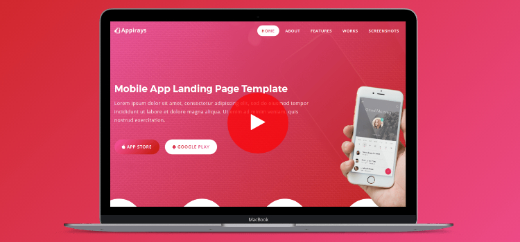
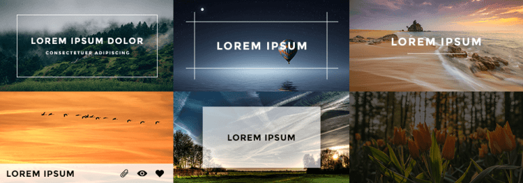
Content on any of the webpage is important, but images help bring out the necessary emotions to make users take action. Images are arguably the most important factor of landing page design. It is very important that the images you are using from the header of the page to those used within the page, are in sync with the content therein particular page to make a message stands out. Images are you using in the page to convey the message should be meaningful, custom, clean, and logical. The best images used in the page and paired with a right content is all that's needed for the successful conversion.
Like images, videos are also used for better conversion on the landing page. No matter what your service or product is, adding a short video will drive the customer through your offer and improve your conversion.
Benefits of videos and images on your landing page:
* Customer/visitor retention- A valuable and informative video will inspire your users to stay longer on your page and allow them to stick to your message.
* Increased trust- Videos give your product life and a voice, which increases user's trust towards your brand.
* Meet customer taste- Generally, many people prefer to watch a 5-minute video rather than read a 15-minute article. If you give people what they want, your landing page will convert better.
9. Call to action
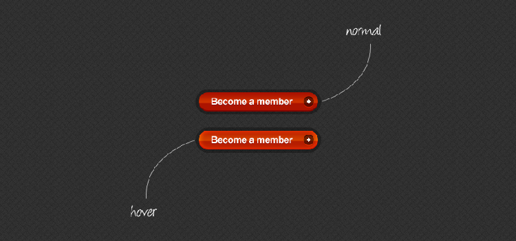
CTAs are one of the most important elements of a landing page, as it is a great way to get users to take action. In order to successfully convert a visitor into email subscribers or customers, you just need a simple, clean, clear and clickable call-to-action. CTAs can be a clickable link or button. Buttons are commonly used as they grab the attention, especially when they are colorful.
