10 Design Tips to Increase User Attention
- Design
-
July 18, 2017
There are numerous strategies involved in creating stunning and functional interfaces. Here’s a collection of 10 that you’ll find helpful in your projects. They’re not related to any specific theme but are a collection of techniques.
1. Converting Link to Block Element
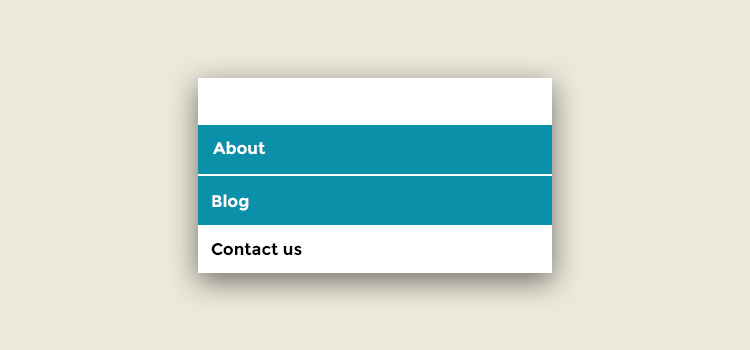
Links or anchors are inline components by default; their clickable area spans just the height and width of the text. This clickable area, or the space where one can click to visit that link’s destination, could be increased for better usability by putting in padding and transforming the link into a block element.
Without a doubt, the bigger the clickable area is, the simpler it is to click on the link because there are lesser chances of missing it. Transforming links into block elements can make the text area span the entire width of the container unless the width is specified.
2. Positioning the Labels
Paying great attention to every little detail is what differentiates an awesome product from an average one. Interface elements like buttons and tabs are clicked several times daily by users, so it makes sense to typeset them properly.
If you use uppercase letters along with lowercase letters with ascenders (“t,” “d,” “f,” “h,” “k” and “l”), the balance shifts upwards, which makes the label look too high on the button. In this case, you should set the type using the upper case height as a guide — or set it a bit higher if the majority of the letters are lowercase.
3. Contrast
In the same way, you can also manage the focus of users’ attention with the contrast between elements. The strongest contrast element is the headline, you could set it so it virtually pops out at the users and the additional elements fade into the background. Fading the extras enables users to effortlessly focus on the most significant pieces of text.
4. Spacing Between Letters
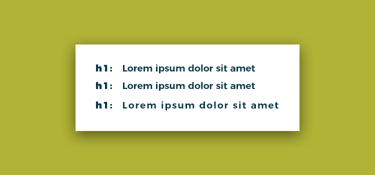
Web design is relatively limiting for typographers. However, while there are just a couple of safe Web fonts and not a great number of things you can try out to style them, it’s really worth remembering that we still have some degree of control. “Tracking” is a term employed in the field of typography to explain the adjustment of spacing between letters in words.
5. Usage of White space
The most important elements in an interface are the white space between elements. If you’re not really acquainted with the term white space, it suggests exactly that: space between one interface element and another, be it a button, a navigation bar, article text, a heading or anything else. By manipulating white space, we can easily point out relationships between specific elements or groups of elements. By setting the headline close to the article text it suggests that it is relevant or related to that text. The text is then positioned away from other elements to separate it and make it more clear and distinct.
6. Color
Color could be utilized to efficiently focus your visitors’ attention on vital or actionable elements. For instance, all through the US presidential election, most of the candidates’ sites had the donation button colored red. Red is a wonderfully bright and impressive color so it draws attention, and it stands out when the other parts of the site are blue or a different color.
7. Focus on Input Fields
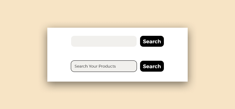
Numerous web applications and sites have forms. These could be search forms or input forms inviting you to submit something. If these forms are the central feature of your site, you could consider automatically focusing the user’s cursor on the input field once the site loads. This can speed things up since users can start typing straight away without clicking on it. A case in point is Google and Wikipedia’s sites.
8. Form Elements
Although the default look of form elements suffices the majority of functions, at times we desire something a bit prettier or a lot more standardized across numerous browsers and systems. You can actually style input fields by just focusing on it with an “id,” “class” or plain old “input,”
9. Extra Utility Controls
A number of Web applications have additional utility controls, like edit and delete buttons, it must not be shown beside each item. They could be hidden to simplify the interface and focus visitors’ attention on the major controls and content. For instance, these hover controls are utilized in Twitter once you hover over messages: These hover controls can be achieved with a few simple CSS code, without any JavaScript.
10. Effective Labels
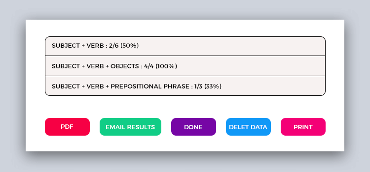
You could make options dialogs a lot more workable by thinking through the labels you use on buttons and links. If an error pops up and the options are "Yes" and "Cancel" you will have to read through the complete message to answer. But you can actually speed things up by making use of verbs in the labels. So, instead of "Yes" and "Cancel" use “PDF”, "Email Results" "Done", "Delete Data" and "Print" buttons, you wouldn’t even have to read the message to know what the options are and which action to execute. Everything is contained in the button labels.
Bonus: For more suggestions on designs you can view alluring web templates that can yield a ravishing looking website that will definitely attract the user's attention. You can find hundreds of millions of articles & information. You may miss some information. But the ready-made pre-designed templates at ThemeVault are crafted to engage the user to your sites. Look at the free website templates in html5 from ThemeVault for more design tips & guides.
