20 Fonts for Free & Every Designer Should Know About
- Design
-
July 13, 2017
Typeface marks great impression. It makes or breaks a website. Well, the first thing that a visitor can notice on a website is its font. When the font is appealing, visitors tend to visit the site often. On the other hand, fonts are not just for display, but it can also create the personality and the environment of a website.
Today's designers use several fonts, and many artistic creators such as Rick Banks, Max Miedinger, Eduard Hoffman, Matthew Carter, and Eric Gill have gained popularity, because of the fonts they have created. Many creative collections are still growing to make designs more glitter.
Helvetica 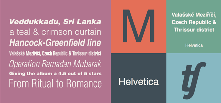 Eduard Hoffman, Mathew Carter, and Max Miedinger together had created Helvetica font in 1957. This typeface design looks simple but has a touch of professionalism. Helvetica can go with different style or theme of web designs.
Clarendon 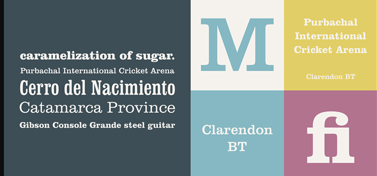 Another creation of Eduard Hoffman but with Herman Eidenbenz. Clarendon was created in 1845, and when 1953 came, it was redesigned with cuts to make it look like the euro signs. This can also go with any design or web page style.
Gill Sans 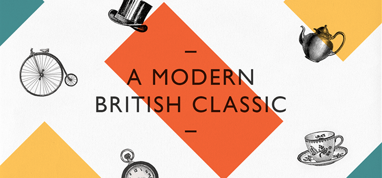 Eric Gill is the designer of the font Gill Sans, and it was designed in 1928. The font is made for the Monotype Corporation integrated with several alternate cuts. The Gill Sans can be seen in different types such as Gill Sans Std, Light Italic, Gill Sans Std Light, Gills Sans Book, and more.
Avenir 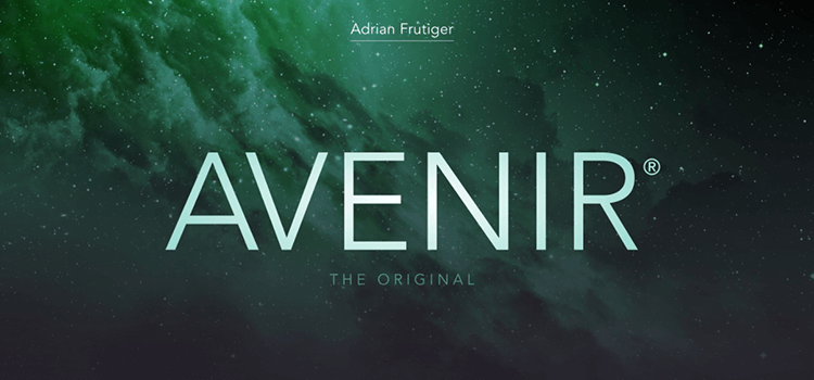 Adrian Frutiger is the designer & creator of the Avenir font. This was designed in 1988, and the creator was inspired to design this font after the san serif font which can be alike with Erbar and Futura. The difference of Avenir from others is its modern touch.
Frutiger 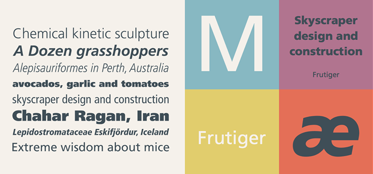 The designer of Avenir is also the designer of Frutiger who is Adrian Frutiger. The font was created when he was designated to create Charles de Gaulle Airport sign. He may have designed other fonts, but still, he chose to create a new one which can be quickly recognized.
Futura 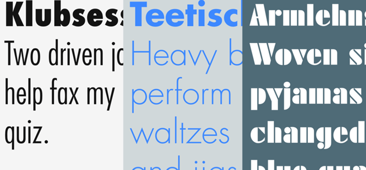 Futura is designed by Paul Renner in 1927 which is the oldest style of san serif.
Franklin Gothic 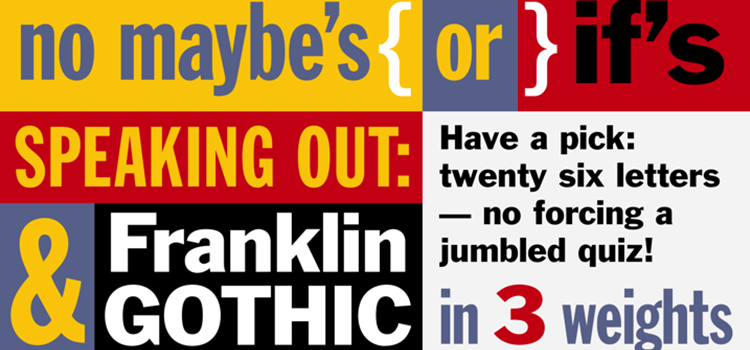 Moris Fuller Benton was the person behind the creation of Franklin Gothic in the 19th century. This is the typeface that is considered as the best of Benton because of its popularity. Then, Victor Caruso revived the font.
Myriad 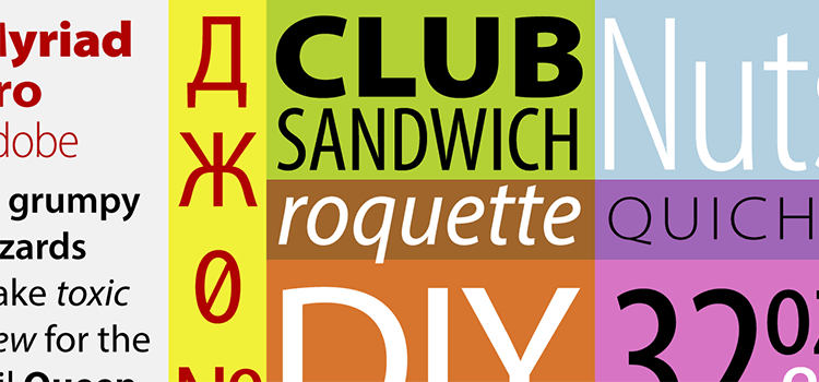 Myriad is designed by Carol Twombly, Fred Brady, Christopher Slye, and Robert Slimbach in 1992. This font specifically made for Adobe font collections.
Optima 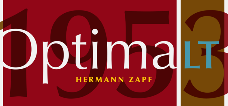 Hermann Zapf and Walter Cunz created the font "Optima" during the 1950s which display elegance and cleanliness.
Univers 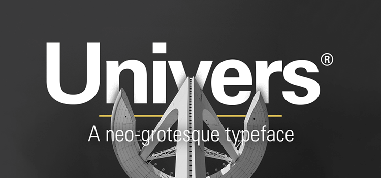 Adrian Frutiger designed the font in 1957 and is considered as one of the best fonts by the designer. Univers was used in varieties of sign projects.
Adobe Garamond 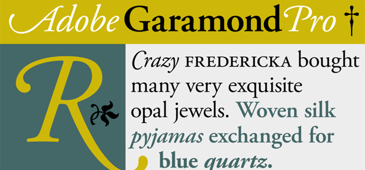 The font "Adobe Garamond" was designed by Robert Slimbach back in 1989.
Palatino 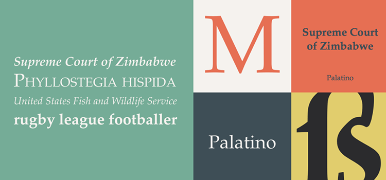 Herman Zapf designed Palatino in 1986 & it resembles the designer’s calligraphy and is alike with Trump Mediaeval. It was initially used by Apple Computer in the Macintosh.
Baskerville 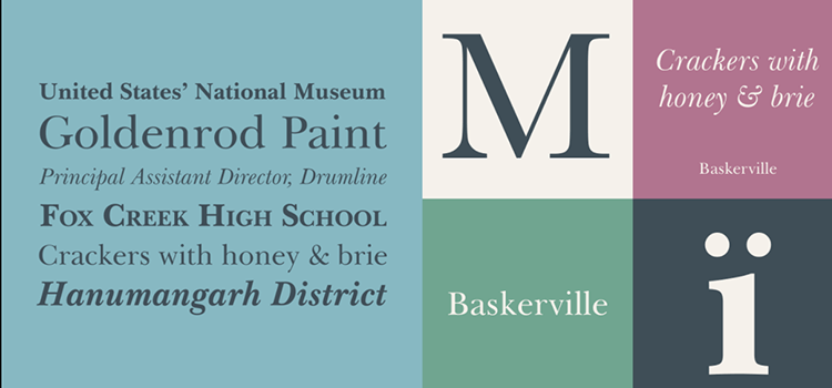 George Williams and John Baskerville are the ones who designed the font "Baskerville" and it is available in different weights such as bold italic, roman, italic, and bold.
Bembo 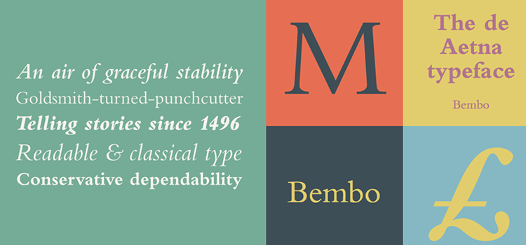 Aldus Manutius, Francesco Griffo and Frank Hinman Pierpont created and designed Bembo in 1929.
Minion 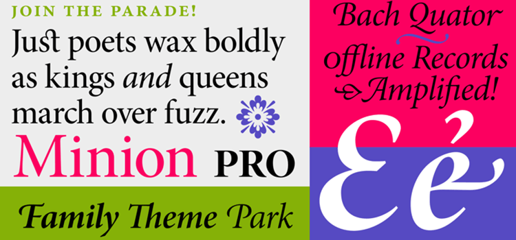 Robert Slimbach designed Minion and has been included in the powerful collection of the font family.
Rockwell 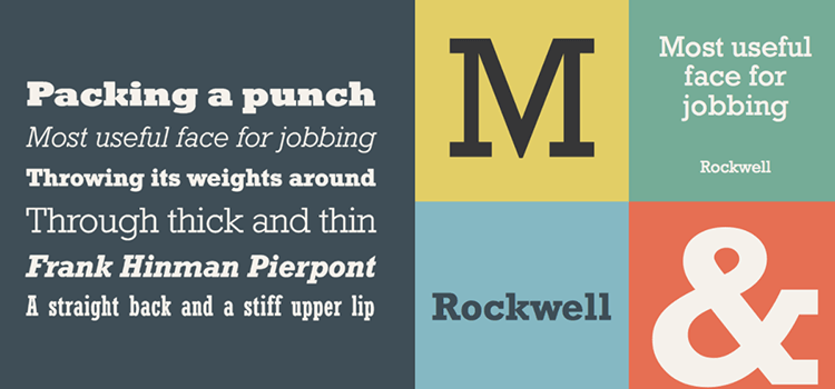 Monotype Corporation designed a slab serif typeface named Rockwell in 1934. It is mono weighted & geometric. Mostly suitable for advertisements and posters.
Century Gothic 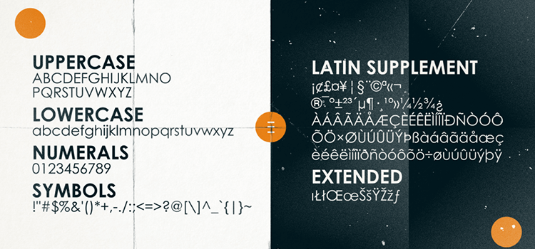 The font "Century Gothic" designed by Morris Fuller Benton and fits for news printing or design publishing.
Adobe Caslon Pro 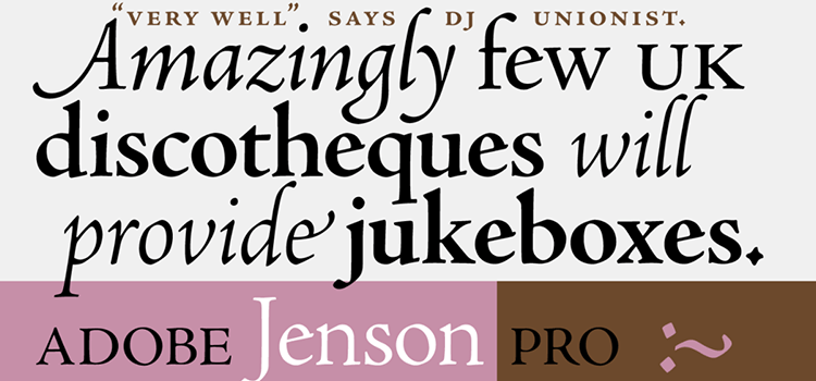 The font has short ascenders which make it distinguishable from other fonts. The serifs are also bracketed. Adobe Caslon Pro is good for journals, magazines, and textbooks.
Times New Roman 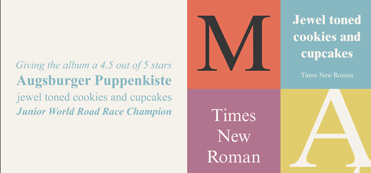 Stanley Morison and Victor Lardent designed Times New Roman in 1932 and it is the general font used for news printing and other publishing materials.
Aileron 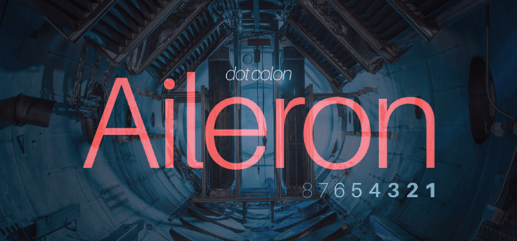 The font "Aileron" is used for the project of air models and it is designed by Sora Sagano.
“Learn the rules like a pro, so you can break them like an artist” by Pablo Picasso
There are some practices & rules to follow while designing art & design. Well, some guidelines & proof are beneficial to move forward. But where to learn about how to efficiently combine typefaces. You can view some free website templates to download for an idea about how the choice of using fonts in designing makes an impact.
